
This article was last updated on October 23, to include browser compatibility considerations, responsive design techniques, and advanced clip-path and masking techniques.
Introduction
Rounded corners on HTML help soften the overall design of a website, giving it a more inviting and user-friendly appearance. We'll examine CSS-created rounded corners in this article.
Steps we'll cover:
- What is CSS border-radius?
- Rounded corners using CSS border-radius
- Elliptical corners using CSS border-radius
- Random corners using CSS border-radius.
- Inverted corners
- Notched corners
What is CSS border-radius?
The border-radius attribute in CSS specifies the radius of a HTML element's corners. The border-radius attribute can have between one and four values.
border-radius: 15px 50px 30px 5px;
- The first value applies to the
top-leftcorner. - The second to the
top-rightcorner. - The third to the
bottom-rightcorner. - The fourth to the
bottom-leftcorner.
The border-radius can be set for all four sides using the shorthand property shown below:
border-radius: 10px;
The border-radius can be set for the top-left-and-bottom-right and top-right-and-bottom-left corners using the shorthand property shown below:
border-radius: 10px 20px;
The border-radius can be set for the top-left , top-right-and-bottom-left, and bottom-right corners using the shorthand property shown below:
border-radius: 10px 20px 30px;
The above examples display that the border-radius attribute can accept a single radius (defined at all the corners). Defining a single radius for the border-radius attribute will form round corners.
Alternatively, the border-radius attribute can also accept two radii to form elliptical corners. An example is shown below:
border-radius: 40px / 10px;
In the sample above, the '/' separates the two radii from each other.
You can also use the shorthand property on the two radii as shown below:
/* (first radius values) / top-left-and-bottom-right | top-right-and-bottom-left */
border-radius: 10px 20px / 20px 30px;

/* (first radius values) / top-left | top-right-and-bottom-left | bottom-right */
border-radius: 10px 5px 15px / 20px 25px 30px;

/* (first radius values) / top-left | top-right | bottom-right | bottom-left */
border-radius: 10px 5px / 20px 15px 30px 35px;
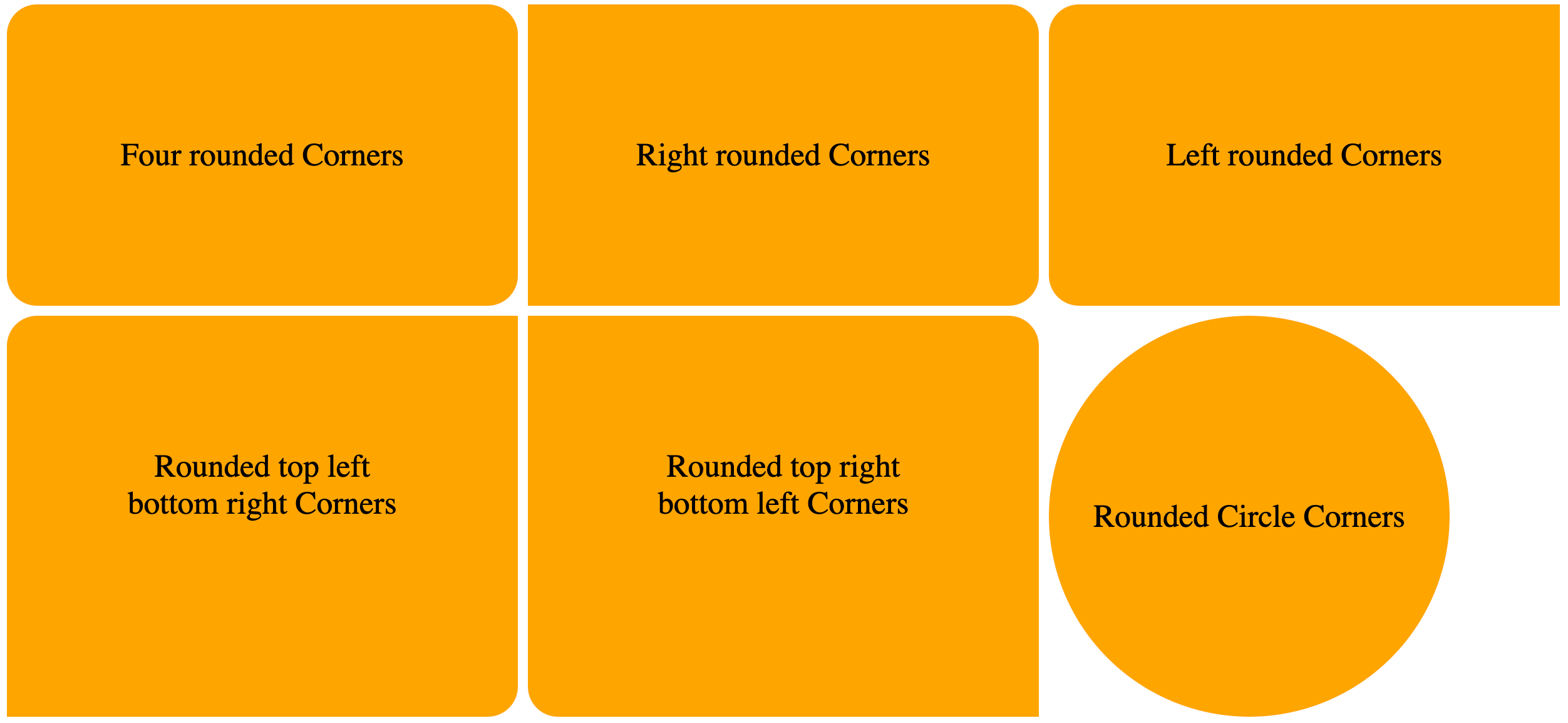
Rounded corners using CSS border-radius
Example:
We will display examples of how to create rounded corners using the border-radius attribute.
HTML:
<html>
  <body>
    <div class="container">
      <div class="four-rounded-corners">
        <p>Four rounded Corners</p>
      </div>

      <div class="rounded-right-corners">
        <p>Right rounded Corners</p>
      </div>

      <div class="rounded-left-corner">
        <p>Left rounded Corners</p>
      </div>

      <div class="rounded-corners-top-left-bottom-right-corners">
        <p>Rounded top left bottom right Corners</p>
      </div>

      <div class="rounded-corners-top-right-bottom-left-corners">
        <p>Rounded top right bottom left Corners</p>
      </div>

      <div class="rounded-circular-corners">
        <p>Rounded Circle Corners</p>
      </div>
    </div>
  </body>
</html>
CSS:
.container {
  display: grid;
  grid-template-columns: 1fr 1fr 1fr;
  grid-gap: 10px;
}

div.four-rounded-corners {
  /* using the shorthand property to set the border radius on all corners */
  border-radius: 30px;
  background: orange;
  padding: 100px;
  text-align: center;
  font-size: 32px;
}

div.rounded-right-corners {
  /* using the shorthand property to set the border radius on the top-right and bottom-right corners */
  border-radius: 0px 30px 30px 0px;
  ...;
}

div.rounded-left-corner {
  /* using the shorthand property to set the border radius on the top-left and bottom-left corners */
  border-radius: 30px 0px 0px 30px;
  ...;
}

div.rounded-corners-top-left-bottom-right-corners {
  /* using the shorthand property to set the border radius on the top-left and bottom-left corners */
  border-radius: 30px 0px 30px 0px;
  ...;
}

div.rounded-corners-top-right-bottom-left-corners {
  /* using the shorthand property to set the border radius on the top-right and bottom-left corners */
  border-radius: 0px 30px;
  ...;
}

div.rounded-circular-corners {
  width: 400px;
  height: 400px;
  /* dynamically setting the radius of the corners to be 50% -- half the width and height of the element */
  border-radius: 50%;
  background: orange;
  font-size: 32px;
  display: grid;
  place-items: center;
}
VIEW:
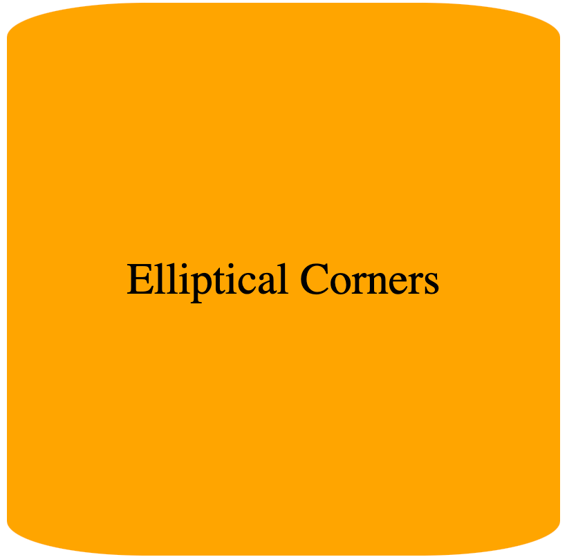
Elliptical corners using CSS border-radius
We will display examples of elliptical borders using CSS border-radius. To create elliptical corners, the border-radius attribute will contain two radii.
Elliptical corners are recognized by the majority of modern browsers. Nonetheless, -webkit versions might be useful for browsers that don't support CSS3 (elliptical corners aren't supported by older versions of -mos-border-radius).
Example
We will create a cylinder-like shape using two radii on the border-radius property.
HTML:
<html>
  <body>
    <div>Elliptical Corners</div>
  </body>
</html>
CSS:
div {
  width: 400px;
  height: 400px;
  border-radius: 100px / 25px; /* setting the 2 radii in the property */
  background: orange;
  font-size: 32px;
  display: grid;
  place-items: center;
}
VIEW:
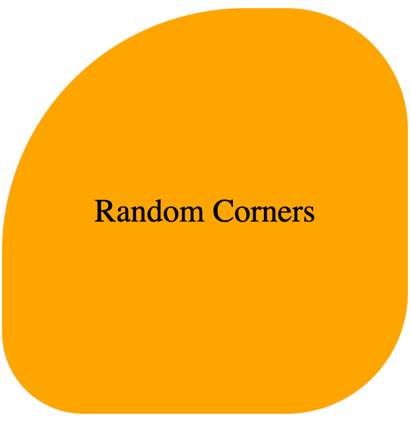
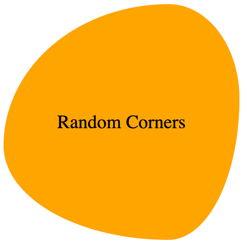
Random corners using CSS border-radius.
We will display examples of random borders using CSS border-radius.
Example 1
We will create a blob-like shape using the radius defined on the border-radius property.
HTML:
<html>
  <body>
    <div>Elliptical Corners</div>
  </body>
</html>
CSS:
div {
  width: 400px;
  height: 400px;
  border-radius: 60% 30% 30% 20%
    /* setting the radius in percentages for random corners */;
  background: orange;
  font-size: 32px;
  display: grid;
  place-items: center;
}
VIEW:
Example 2:
We will create a blob like shape using the 2 radii defined on the border-radius property.
CSS
div {
  width: 400px;
  height: 400px;
  border-radius: 70% 30% 30% 70% / 60% 40% 60% 40%;
  background: orange;
  font-size: 32px;
  display: grid;
  place-items: center;
}
VIEW:
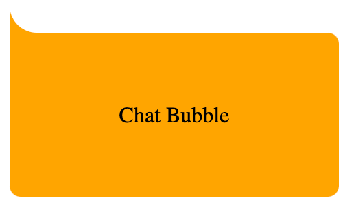
Inverted corners
The basic idea for making an inverted corner is to make a pseudo element, remove the border-radius from the corner on the div (bearing the pseudo element) where we want to add the inverted corner, and then cut a border-radius out of that pseudo element.
Next, we use a box-shadow to give the pseudo element's shadow the same color as the parent div element.
Example:
We will create a chat bubble using the idea of inverted corners.
HTML:
<html>
  <body>
    <div>Chat Bubble</div>
  </body>
</html>
CSS:
div {
  margin-top: 50px;
  position: relative;
  width: 200px;
  height: 80px;
  /* background of main div*/
  background: orange;
  padding: 20px;
  border-radius: 0px 8px 8px 8px;
  display: grid;
  place-items: center;
}

div:before {
  content: "";
  position: absolute;
  top: -40px;
  left: 0;
  height: 40px;
  width: 40px;
  background: transparent;

  /* border-radius of pseudo element */
  border-bottom-left-radius: 50%;

  /* box shadow to give the shadow of the pseudo-element the same color as the background */
  box-shadow: 0 20px 0 0 orange;
}
VIEW:
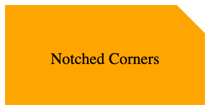
Notched corners
We will display examples of notched borders using CSS.
Example 1:
The basic idea for making an notched corner in this example is as follows:
- Create a
pseudoelement from adivelement, - Collapse the
pseudoelement on the section of thedivwhere you want to make the notched corner. - Create a
boxshadow on thepseudoelement. - Set
overflow: hiddenon thedivelement to conceal the overflowing bits of its child elements. - Use the
box-shadowof the pseudo-element to fill the background of the parentdivelement.
We will create a partly truncated div element using the idea of notched corners.
HTML:
<html>
  <body>
    <div class="notched-corner">
      <p>Notched Corners</p>
    </div>
  </body>
</html>
CSS:
div.notched-corner {
  position: relative;
  width: 200px;
  height: 100px;
  background-color: transparent;
  overflow: hidden;
}

div.notched-corner:before {
  content: "";
  position: absolute;
  left: 90%;
  top: -20%;
  width: 40px;
  height: 40px;
  transform: rotate(45deg);
  background-color: transparent;
  box-shadow: 0 0 0 250px orange;
}

p {
  position: absolute;
  top: 35%;
  left: 50%;
  width: 100%;
  text-align: center;
  transform: translate(-50%, -35%);
}
VIEW:
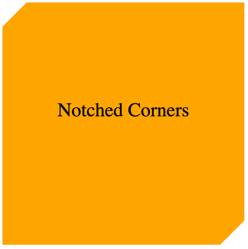
Example 2:
The clip-path parameter specifies which section of an element should be shown. It can be combined with the polygon() method to form a notched corner (or complex shapes).
HTML:
<html>
  <body>
    <div class="notched-corner">
      <p>Notched Corners</p>
    </div>
  </body>
</html>
CSS:
div.notched-corner {
  position: relative;
  width: 400px;
  height: 400px;
  overflow: hidden;
  background: orange;
  clip-path: polygon(
    0 10%,
    10% 0,
    90% 0,
    100% 0%,
    100% 90%,
    90% 100%,
    0% 100%,
    0% 90%,
    0% 10%
  );
}

p {
  position: absolute;
  top: 35%;
  left: 50%;
  width: 100%;
  text-align: center;
  transform: translate(-50%, -35%);
  font-size: 32px;
}
VIEW:
Advanced Clip-Path and Masking Techniques
Thus, by defining the visibility and invisibility of parts of an element, we could use the property of CSS known as clip-path for creating complex shapes. This is very useful in providing a design beyond the usual cases of rounded or square borders. With clip-path, we will be able to create shapes such as polygons, circles, and even the more complex, irregular shapes.
How clip-path Works
The clip-path property accepts a shape as a value, and then "clips" the element to fit that shape. Some common values that clip-path might take on are as follows:
- Circle: Creates a circular clipping mask.
- Ellipse: Creates an ellipse-shaped mask.
- Polygon: Defines a shape by specifying a sequence of points. For example, triangles, pentagons, and any other polygon shapes can be created.
- Inset: Creates a rectangular clipping mask whose inset can be different for all sides.
Using clip-path to Create a Triangle
div {
  width: 200px;
  height: 200px;
  background-color: orange;
  clip-path: polygon(50% 0%, 0% 100%, 100% 100%);
}
Above example, a triangle shape is created where the polygon() function defines the top, left, and right points of the shape. This creates a clipped element showing only content within the defined triangular area.
Building a Custom Blob Shape with clip-path
For more organic, blob-like shapes, we can use clip-path with percentages:
div {
  width: 300px;
  height: 300px;
  background-color: lightblue;
  clip-path: polygon(50% 0%, 100% 38%, 79% 100%, 21% 100%, 0% 38%);
}
Irregular, liquid shape; good for more creative designs such as buttons or containers.
Using clip-path for Hover Effects
Another advanced use case for clip-path is in hover animation. Hovering over an element to change its shape gives an interactive and dynamic nature to your design.
Shape morphing on hover
div {
  width: 200px;
  height: 200px;
  background-color: salmon;
  clip-path: circle(50%);
  transition: clip-path 0.3s ease;
}

div:hover {
  clip-path: polygon(50% 0%, 0% 100%, 100% 100%);
}
Notice in this example how the element transitions from a circle to a triangle on hover: To make the shape transition smooth, add the transition property:.
Masking Techniques
While the clip-path property is about clipping parts of an element, CSS Masking allows making parts of an element transparent by applying an image or gradient mask to it. Masking helps especially when you want to bring into view certain parts of some element in a more complex manner, say creating cutouts or custom transparency effects.
Example: Using Image Masking
div {
  width: 300px;
  height: 300px;
  background-color: coral;
  mask-image: url("path-to-mask-image.png");
  mask-size: cover;
}
In this case, the image defines which parts of the element are visible: the lighter parts of the mask image are fully visible; darker parts become transparent. This can be used for making detailed cutouts or other decorative effects.
Complex Shapes with SVG+CSS
While it's true that border-radius and clip-path give you some creative forms, when it gets really detailed, for the most flexibility, SVG (Scalable Vector Graphics) in conjunction with CSS opens the most doors. SVG is a vector-based format - which means infinite scaling capabilities with no loss of quality - making it ideal for modern web design. Using the combination of SVG and CSS will let us create complex shapes and interactions that reach beyond the limitations of pure CSS.
Why Use SVG for Complex Shapes?
SVG allows for a precision and flexibility that you simply can't get with CSS. SVG lets you draw vector shapes: things like paths, circles, polygons, among others. You can then style those shapes with CSS to animate it, change its color, or interact with it, making SVG very powerful for web developers.
Example: Star shape creation with SVG
The following is a basic example of creating a star using SVG:
<svg width="200" height="200" viewBox="0 0 100 100">
  <polygon
    points="50,15 61,35 82,35 67,50 73,70 50,60 27,70 33,50 18,35 39,35"
    fill="gold"
  />
</svg>
The above example uses the polygon element to define the points of the star. Each pair of numbers will be the X and Y coordinates for a point on the star, offering very specific drawing of the shape.
Combining SVG with CSS for Styling
Once you have your SVG shape, you can directly style it with CSS. It's great if you need to add something like hover effects, transitions, or animations.
Hover Animation of Star
<svg width="200" height="200" viewBox="0 0 100 100" class="star">
  <polygon
    points="50,15 61,35 82,35 67,50 73,70 50,60 27,70 33,50 18,35 39,35"
    fill="gold"
  />
</svg>
-star {
  transition: transform 0.3s ease;
}

/star:hover {
  transform: rotate(360deg);
}
We also added a rotation animation in this example while hovering the star. This mix of SVG and CSS opens many more possibilities rather than using pure CSS shapes.
Using SVG Paths for Complex Shapes
With SVG, the <path> element allows you to describe, in quite complex detail, a shape using a series of commands and sets of coordinates. This is useful for creating logos, icons, or any other time you'd want to make use of a custom shape that CSS alone can't achieve.
Example: Custom Shape w SVG Path
<svg width="200" height="200" viewBox="0 0 100 100">
  <path
    d="M50,10 Q80,40 50,90 Q20,40 50,10 Z"
    fill="lightgreen"
    stroke="black"
    stroke-width="2"
  />
</svg>
This code uses the 'Q' command, which allows you to define a path with quadratic bézier curves for custom paths providing control over curvature. The result is an organic shape so complex, which would have been almost impossible to achieve using only CSS.
CSS and SVG Integration
You can also inline SVGs directly into your HTML, and style them like any other HTML node. Below is an example of dynamically changing the color of an SVG shape using CSS:
<svg width="200" height="200" viewBox="0 0 100 100" class="dynamic-shape">
  <circle cx="50" cy="50" r="40" />
</svg>
Here’s your content formatted correctly:
.dynamic-shape {
  fill: lightblue;
  transition: fill 0.3s ease;
}

.dynamic-shape:hover {
  fill: orange;
}
In the example above, upon hover, the circle changes from light blue to orange. This makes the SVG interactive.
When to Use SVG Over CSS
- Precision: SVGs are ideal when you want pixel-perfect precision, such as for logos or icons.
- Scalability: SVGs allow infinite scaling without quality loss and are great for responsive design.
- Complex Shapes: If you need a shape that goes beyond what
clip-pathorborder-radiuscan handle, SVG is the best option. - Animations and Interactions: SVGs are highly animatable, and when combined with CSS, they create limitless possibilities for dynamic and interactive designs.
Both clip-path and SVGs offer much more for web design than just rectangular and circular shapes. If you want to create custom shapes or interactive animations, combining these techniques with CSS gives your designs a polished, unique look.
Conclusion
In this article, we discussed numerous approaches for building different sorts of corners utilizing CSS features like border-radius, pseudo-elements, box-shadow, clip-path, and many others. With this information, you can construct a variety of visually appealing and inviting designs for your websites or web applications.