

CAUTION
This post was created using version 3.x.x of Refine. Although we plan to update it with the latest version of Refine as soon as possible, you can still benefit from the post in the meantime.
You should know that Refine version 4.x.x is backward compatible with version 3.x.x, so there is no need to worry. If you want to see the differences between the two versions, check out the migration guide.
Just be aware that the source code example in this post have been updated to version 4.x.x.
Introduction
In this article, you'll see how to create responsive navbars in Refine apps using the following CSS frameworks:
- Tailwind CSS
- Bootstrap
Refine is a React-based framework for building internal tools using helper hooks, components, and providers. It provides amazing functionality for rapid development while ensuring extreme customizability. Everything is separate from your UI components and business logic in refine-based Apps. So, you can create UI components or code your flow. You can build admin panels, B2B applications, and dashboards using refine. But it's not limited to only these three scenarios.
Steps we'll cover:
- Setting Up a Refine App
- Responsive Navbar with Tailwind
- Add navigation functionality to the navbar
- Responsive Navbar with Bootstrap
- Add React Router to Bootstrap Navbar
Setting Up a Refine App
We'll use superplate tool to create an empty React-based Refine application.
npm create refine-app@latest refine-navbar -- -o refine-headless -b v3
Navigate to the refine-navbar folder and run npm run dev command.
We're using four resources posts, categories, users and events for the navigation purpose.
Create pages/posts folder
export const postList = () => <p className="post">Post Page</p>;
Create pages/categories folder
export const categoryList = () => <p className="category">Category Page</p>;
Create pages/users folder
export const userList = () => <p className="user">User Page</p>;
Create pages/events folder
export const eventList = () => <p className="event">Event Page</p>;
Create index.tsx file inside pages folder and add the following code to it.
export * from "./posts";
export * from "./categories";
export * from "./users";
export * from "./events";
<Refine /> is the root component of the application. resources is a property of <Refine /> representing API Endpoints. The name property of every single resource should match one of the endpoints in your API.
resources use Page components to handle data and perform rendering. Page components are passed to resources as an array of objects.
Add these resources as a prop to the <Refine /> component:
import { Refine } from "@refinedev/core";
import React from "react";
import "App.css";
import routerProvider from "@refinedev/react-router-v6";
import dataProvider from "@refinedev/simple-rest";
import { postList, categoryList, userList, eventList } from "pages";

const App: React.FC = () => {
  return (
    <Refine
      routerProvider={routerProvider}
      dataProvider={dataProvider("https://api.fake-rest.refine.dev")}
      resources={[
        { name: "posts", list: postList },
        { name: "categories", list: categoryList },
        { name: "users", list: userList },
        { name: "events", list: eventList },
      ]}
    />
  );
};

export default App;
Refine works based on consuming data from APIs. You can consume Rest APIs using dataproviders. Data providers are Refine components that make it possible to consume APIs and data services easily.
For this tutorial, we don't want consume API since we only want to focus navigating. The key point is dataProvider is required property. So we need give it anyway even if we don't want to consume the API. We use the fake Rest API available at https://api.fake-rest.refine.dev/.
Also, add following code inside App.css:
.post,
.category,
.user,
.event {
  text-align: center;
}
and import it inside App.tsx:
import "App.css";

Responsive Navbar with Tailwind
Tailwind provides utility classes for creating components. We need to set up Tailwind CSS before starting to create a navbar with it.
Install tailwindcss and its peer dependencies using the following command:
npm i -D tailwindcss postcss autoprefixer
Then, init command to generate tailwind.config.js file.
npx tailwindcss init
Now, add paths of all template files in tailwind.config.js file:
module.exports = {
  content: ["./src/**/*.{js,jsx,ts,tsx}"],
};
After that, add all @tailwind directives in src/index.css file:
@tailwind base;
@tailwind components;
@tailwind utilities;
Add "index.css" import inside the src/App.tsx file.
import "index.css";
Now, We can use Tailwind to style our application.
We're using the following tailwind classes for creating a responsive navbar layout:
flexsets the display mode of container to flex.flex-colchanges the flex direction to column.min-h-screensets the minimum height of the element to min-height: 100vh.container max-autocenters the container.flex justify-betweenadds space between the flex items.w-32indicates that element has (32*4) 128px width.ml-2provides 8px margin to the element from left.items-centerpushes items to the center.hiddensets element visibility to hidden.md:flexdisplays flex when screen size is atleast medium.md:hiddensets visibility to hidden when screen size is atleast medium.text-green-500changes text color to green with 500 font weight.bg-whitesets the background color of the element to white.
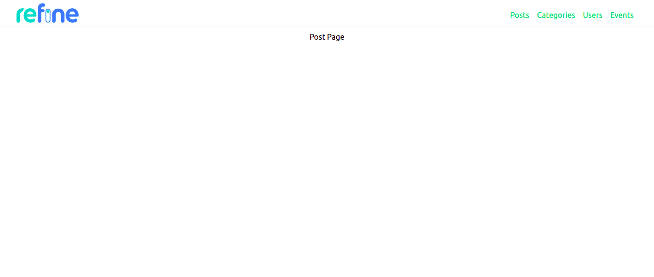
Layout component is used for the customization of Refine app's layout. Create components/Layout.tsx file inside the src folder.
Create the following navbar using Tailwind CSS inside the Layout component. We can get all the menuItems from <Refine /> using useMenu() hook.
import { useMenu, LayoutProps } from "@refinedev/core";
import React from "react";

export const Layout: React.FC<LayoutProps> = ({ children }) => {
  const { menuItems } = useMenu();

  return (
    <div className="flex min-h-screen flex-col">
      <div className="mb-2 md:border-b py-2">
        <div className="container mx-auto">
          <div className="flex justify-between gap-2">
            <img
              className="w-32 ml-2"
              src="https://refine.dev/img/refine_logo.png"
              alt="Logo"
            />
            <ul className="hidden md:flex">
              {menuItems.map(({ name, route }) => (
                <li key={name} className="float-left">
                  <a className="flex cursor-pointer items-center gap-1 rounded-sm px-2 py-1 mt-2 capitalize decoration-indigo-500 decoration-2 underline-offset-1 transition   duration-300 ease-in-out">
                    <span className="text-green-500">{name}</span>
                  </a>
                </li>
              ))}
            </ul>
          </div>
        </div>
      </div>
      <div className="bg-white">{children}</div>
    </div>
  );
};
This layout is passed as a prop to the <Refine /> component:
import { Layout } from "components/Layout";

const App: React.FC = () => {
    return (
        <Refine
            ...
            Layout={Layout}
        />
    );
};
The output of the above code is as follows:
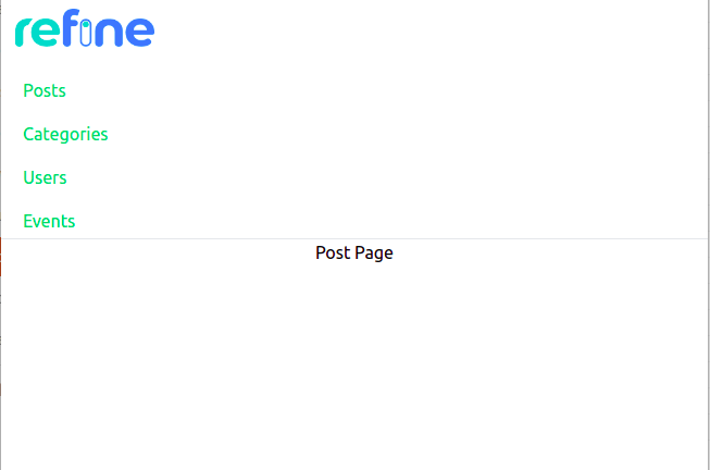
Let's make it mobile responsive by adding the mobile menu:
...
<div className="flex flex-col md:hidden border-b pl-3">
    {menuItems.map(({ name, route }) => (
        <a className="flex cursor-pointer items-center gap-1 rounded-sm px-2 py-1 mt-2 capitalize decoration-indigo-500 decoration-2 underline-offset-1 transition     duration-300 ease-in-out"
        >
            <span className="text-green-500">{name}</span>
        </a>
    ))}
</div>
...
Add navigation functionality to the navbar
We need to use Link component in the Layout.tsx will look like this:
import { useMenu, LayoutProps, useRouterContext } from "@refinedev/core";
import React from "react";

export const Layout: React.FC<LayoutProps> = ({ children }) => {
  const { menuItems } = useMenu();
  const { Link } = useRouterContext();

  return (
    <div className="flex min-h-screen flex-col">
      <div className="mb-2 md:border-b py-2">
        <div className="container mx-auto">
          <div className="flex justify-between gap-2">
            <img
              className="w-32 ml-2"
              src="https://refine.dev/img/refine_logo.png"
              alt="Logo"
            />
            <ul className="hidden md:flex">
              {menuItems.map(({ name, route }) => (
                <li key={name} className="float-left">
                  <Link
                    className="flex cursor-pointer items-center gap-1 rounded-sm px-2 py-1 mt-2 capitalize
                                    decoration-indigo-500 decoration-2 underline-offset-1 transition duration-300 ease-in-out"
                    to={name}
                  >
                    <span className="text-green-500">{name}</span>
                  </Link>
                  //highlight-
                </li>
              ))}
            </ul>
          </div>
        </div>
      </div>
      <div className="bg-white">{children}</div>
    </div>
  );
};
Responsive Navbar with Bootstrap
I've already walked you through setting up Refine app. Now, we'll create navbar inside Layout.tsx and pass it as a prop to <Refine /> component.
First, install react-bootstrap:
npm install bootstrap react-bootstrap
react-bootstrap comes only with js. It doesn't have any CSS styles. That's why we installed bootstrap, which contains CSS.
import "bootstrap/dist/css/bootstrap.min.css";
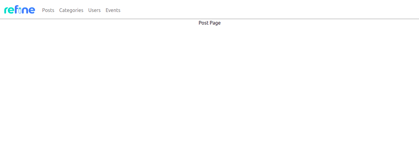
Add navbar component inside the layout component and then create navbar items. We'll use Refine logo for our navbar.
import { Navbar, Nav } from "react-bootstrap";

<div>
  <Navbar className="navbar-border">
    <img
      className="brand-image"
      src="https://refine.ams3.cdn.digitaloceanspaces.comundefined"
      width="100px"
      height="100px"
    />
    <Nav>
      {menuItems.map(({ name, label, icon, route }) => (
        <Nav.Link className="nav-link">{name}</Nav.Link>
      ))}
    </Nav>
  </Navbar>
  <div>{children}</div>
</div>;
Add following CSS classes to App.css file:
.navbar-border {
  border-bottom: 1px solid gray;
}

.nav-link {
  margin-top: 5px;
  text-transform: capitalize;
}

.brand-image {
  margin: 0 15px !important;
}
<Navbar.Toggle /> creates hamburger menu when screen size equals to minimum width set by expand attribute in Navbar component. You can do this in the following way:
import { useMenu, LayoutProps } from "@refinedev/core";
import React from "react";
import "bootstrap/dist/css/bootstrap.min.css";
import { Navbar, Nav } from "react-bootstrap";

export const Layout: React.FC<LayoutProps> = ({ children }) => {
  const { menuItems } = useMenu();

  return (
    <div>
      <Navbar className="navbar-border" expand="lg">
        <img
          className="brand-image"
          src="https://refine.ams3.cdn.digitaloceanspaces.comundefined"
          width="100px"
          height="100px"
        />
        <Navbar.Toggle />
        <Navbar.Collapse>
          <Nav>
            {menuItems.map(({ name, label, icon, route }) => (
              <Nav.Link className="nav-link">{name}</Nav.Link>
            ))}
          </Nav>
        </Navbar.Collapse>
      </Navbar>
      <div>{children}</div>
    </div>
  );
};

Add React Router to Bootstrap Navbar
Now, we're done with creating a responsive navbar using react-bootstrap.
Add <Link> component inside <Nav> like this:
import { useMenu, LayoutProps, useRouterContext } from "@refinedev/core";
import React from "react";

import "bootstrap/dist/css/bootstrap.min.css";
import { Navbar, Nav } from "react-bootstrap";

export const Layout: React.FC<LayoutProps> = ({ children }) => {
  const { menuItems } = useMenu();
  const { Link } = useRouterContext();

  return (
    <div>
      <Navbar className="navbar-border" expand="lg">
        <img
          className="brand-image"
          src="https://refine.ams3.cdn.digitaloceanspaces.comundefined"
          width="100px"
          height="100px"
        />
        <Navbar.Toggle />
        <Navbar.Collapse>
          <Nav>
            {menuItems.map(({ name, label, icon, route }) => (
              <Link className="nav-link" to={name}>
                <span>{name}</span>
              </Link>
            ))}
          </Nav>
        </Navbar.Collapse>
      </Navbar>
      <div>{children}</div>
    </div>
  );
};
Conclusion
Refine works with any custom design or UI framework. Every UI framework helps in creating layouts by providing utility classes or pre-designed components. In this article we implemented responsive navbar using Tailwind and Bootstrap. You can choose any framework and design components according to your needs.
Example
npm create refine-app@latest -- --example blog-responsive-navbar